
A documentary filmmaker’s website
The director makes documentaries, short and feature-length films. His site had to show his films first, then give people a way to contact him, in French as well as English.
- Deliverable
- live website, hosting
- Role
- website design, development lead, launch
- My part
- I decide and test, Claude Code writes the code.
- Client
- documentary filmmaker
- Team
- solo, with Claude Code
- Duration
- 1 month
- Live
- since October 2026

Context
Show his films first.
How do you make people want to see the films, then contact the director?
Design
Decisions
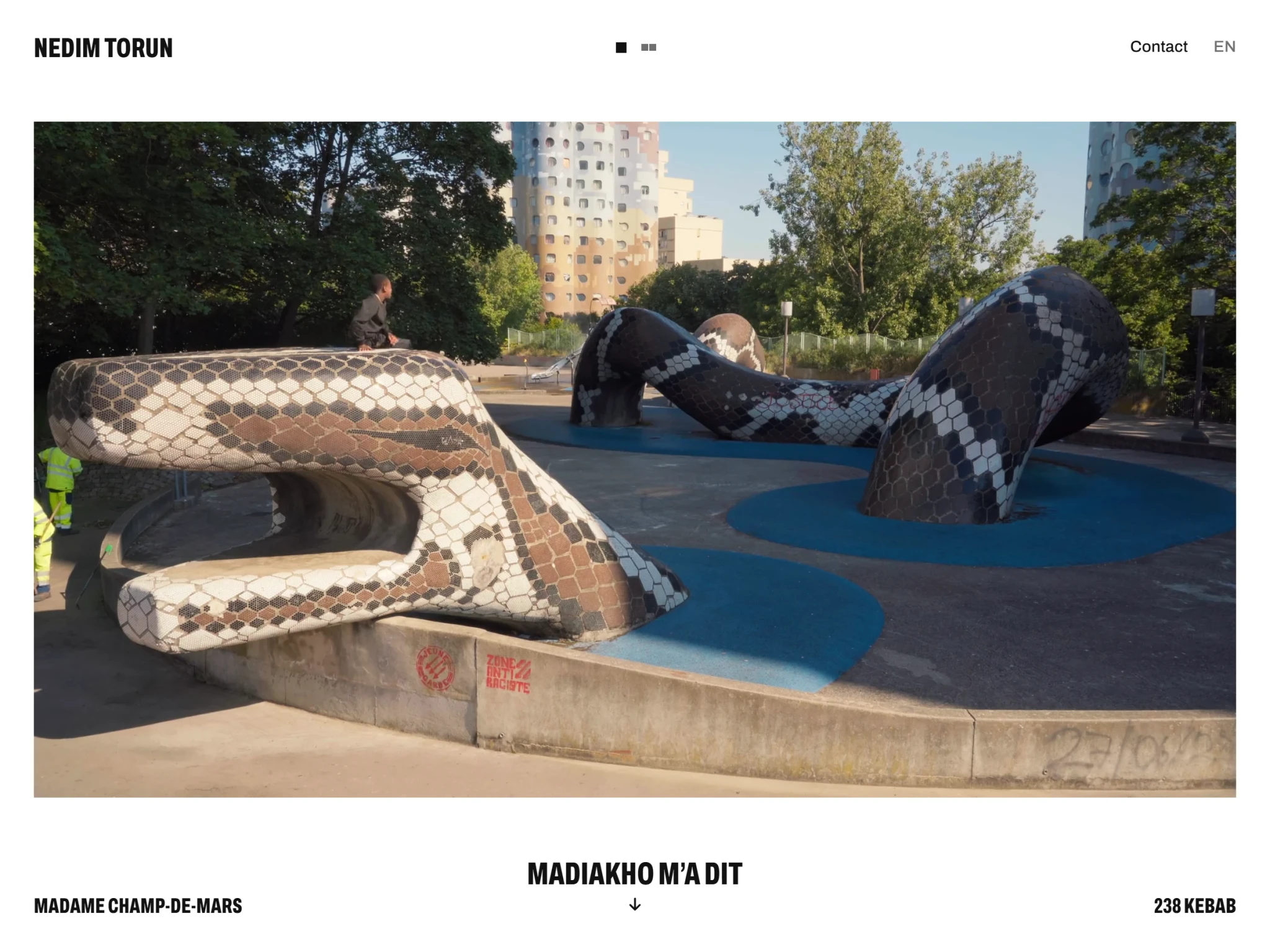
The film first
The player takes up all the space, at the same distance from the name as from the bottom bar.
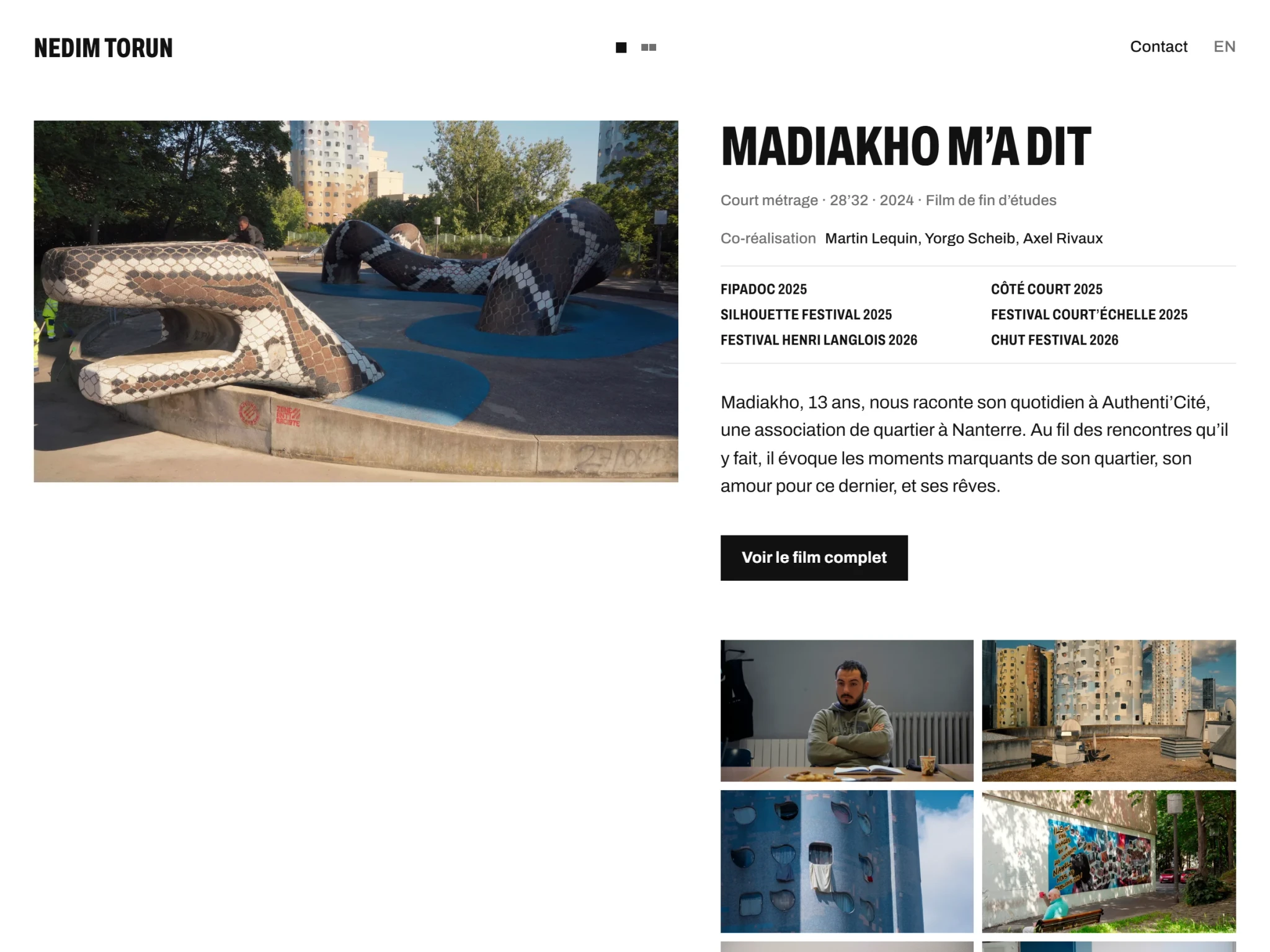
Docked
A downward gesture, or the title and its arrow, docks the video on the left and opens the description. There is no in-between position.
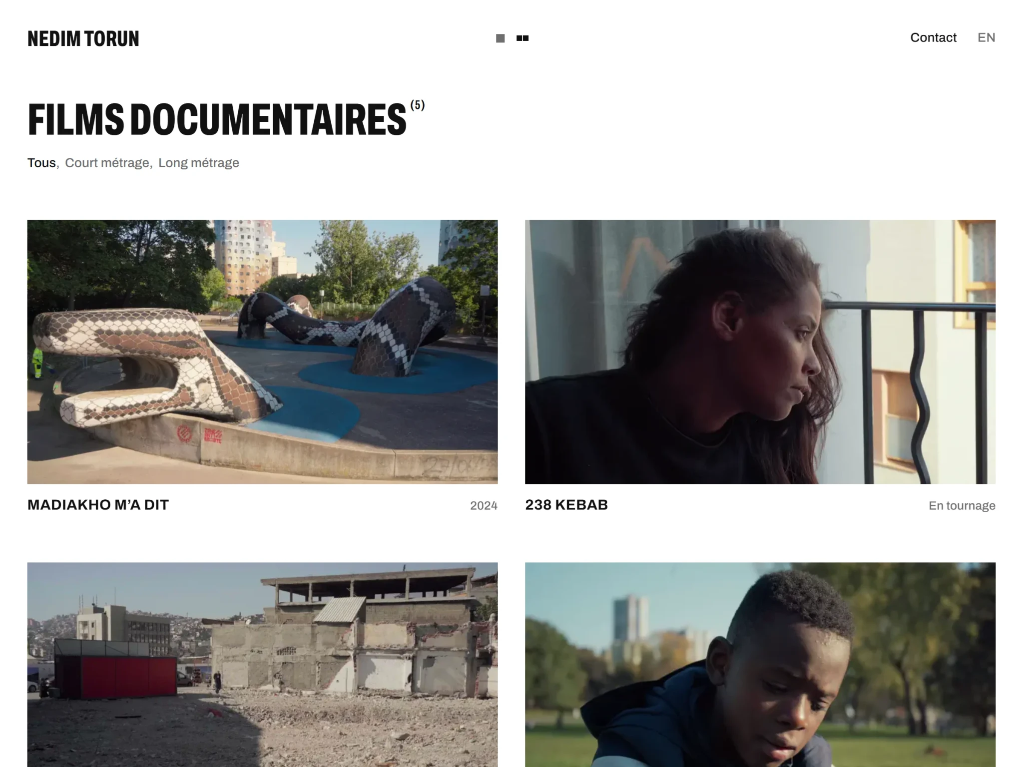
Two films per row at most
So that two projects are never confused. On hover, the film’s video starts playing in its tile.
- Neighbouring films, in the titles' voiceThe names of the previous and next films use the titles' typeface. On hover, their poster follows the mouse as a thumbnail; a sideways gesture changes film, one at a time.
- A single action stands out“Watch the full film”, in white on black, just below the synopsis.
- The status, nothing elseIn the grid, each film only shows its title and its status: the year, or “In production”. The rest is in the description.
- Loading opens onto the filmA percentage follows the line as it fills. Then the line stretches to the width of the video and a window opens in its place: you land straight on the film, without a fade.
- Festivals as a roll of honourThe film’s selections, in condensed capitals, set between two rules as on a poster, with no drawn laurels.
- End creditsThe footer reads like the end of a film: the name, then the roles to the left of the axis and the names to the right (contact, Instagram, site).
- “Contact”, in one wordIn the header, “Contact” replaces “Information - contact”. The page opens on the email address and Instagram; the text comes before the photo, set in the top right corner.
Retrospective
What I learned
- Video on iPhone has its own rulesMuted sound, inline playback, Low Power Mode: each safeguard in the player answers a problem seen on iPhone.
- Hierarchy without shrinkingNo text under 14 px: hierarchy comes from weight, grey and letter spacing.
- A single typefaceOne variable font carries the site’s three voices: the text, the numbers and the poster titles.